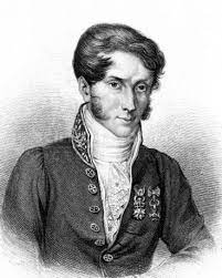
威廉·普莱费尔
18世纪末
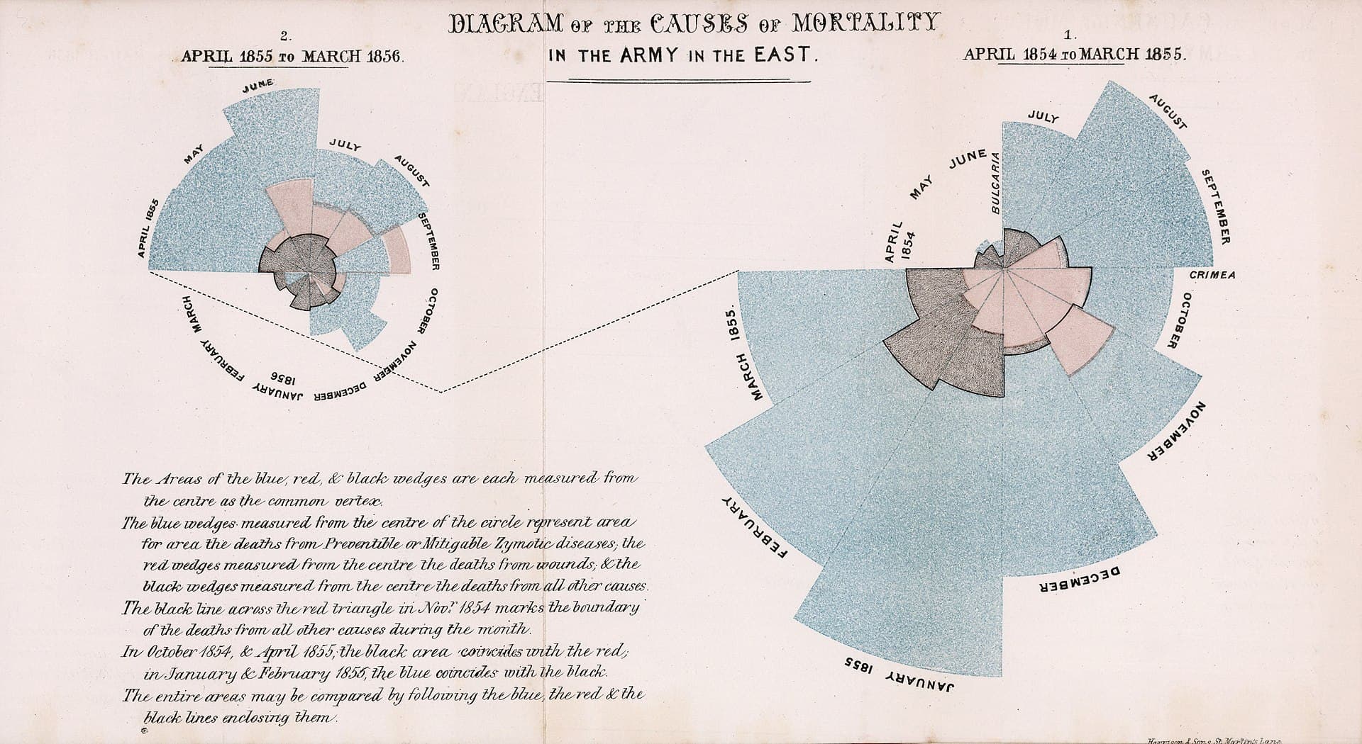
弗洛伦斯·南丁格尔
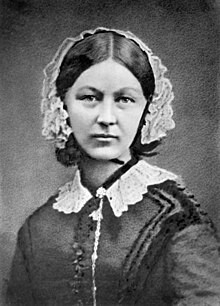
弗洛伦斯·南丁格尔(Florence Nightingale)
1858年
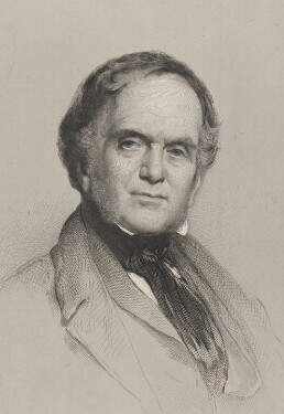
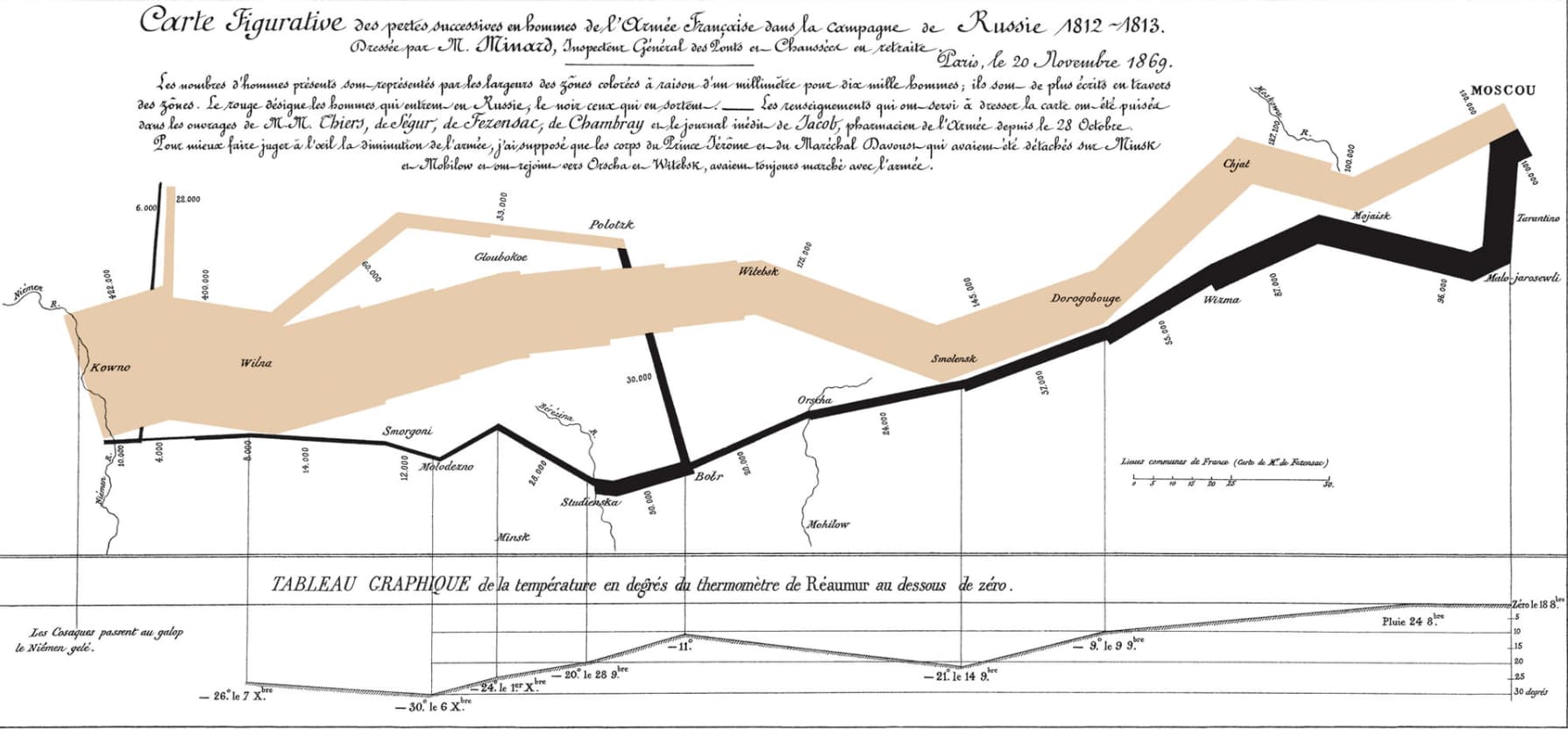
查尔斯·米纳尔
1861年
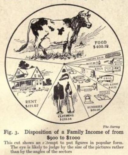
威拉德·布林顿
1914年

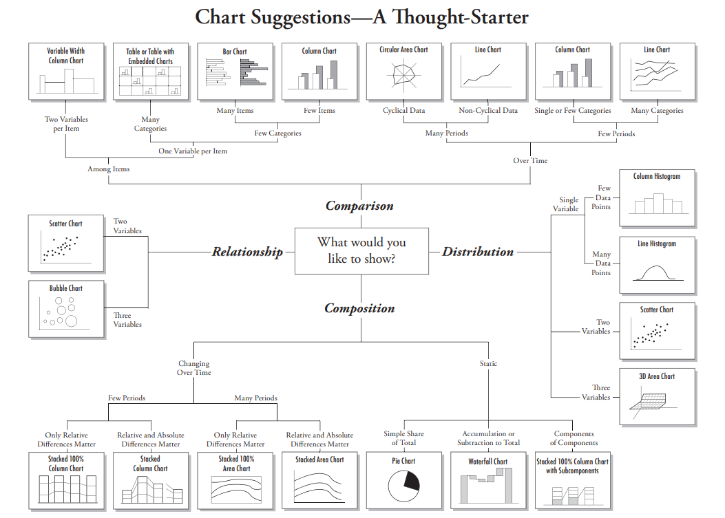
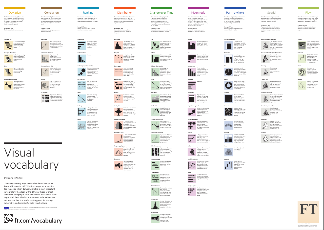
安德鲁·阿贝拉(Dr. Andrew Abela)
安德鲁·阿贝拉(Andrew Abela)是美国天主教大学的教务长及曾经的商学院主任。他在2013年一篇博客中提到了一个图表类型选择方案,即以问题为导向辅助人们选择最佳图表类型。实际上,这张图早在2009年就被安德鲁创造出来。2023年,安德鲁在最新的博客中对这个框架做了稍详细的介绍。
在制作数据视图时,我们遇到的一个基本问题是:需要选择什么类型的视图?安德鲁框架提示我们从一个面对自己的问题开始思考:我们需要展示什么?
Comparison: This is when we want to compare the different categorical values or attributes within the data with each other. There are some variants, depending on the data. For example: Does the data include the time variable? How many time periods? How many variables and categories does the data present?
Composition: This is when we want to know how the data is composed, that is, what general characteristics are present in the data set. There are some variants, depending on the data. For example: Are there changes over time? How many time periods are there? In static data, do you have values that accumulate?
Distribution: This is when we want to understand how the individual data points are distributed within the entire data set. Depending on the number of variables in which we want to analyze the distribution, we can choose bar charts, line charts or scatter charts.
Relationship: In this case, we are interested in knowing how the values and attributes are related to each other. To relate the values, scatter charts are usually used when two variables are involved, and bubble charts are used when three variables are involved.
安德鲁框架按4个类型的方向提供了具体的细分图表类型。